BRANDING CASE STUDY
POWERHOUSE AUDITS
UK-based startup Powerhouse Audits came to the table with big ambitions and a clear vision for growth. Positioned as subject matter experts in the field of AI-driven data analysis, they needed a brand that could match their energy, agility, and forward-looking approach. The challenge was to create an identity that felt dynamic and innovative, whilst also being versatile enough to grow with the company as it scales.
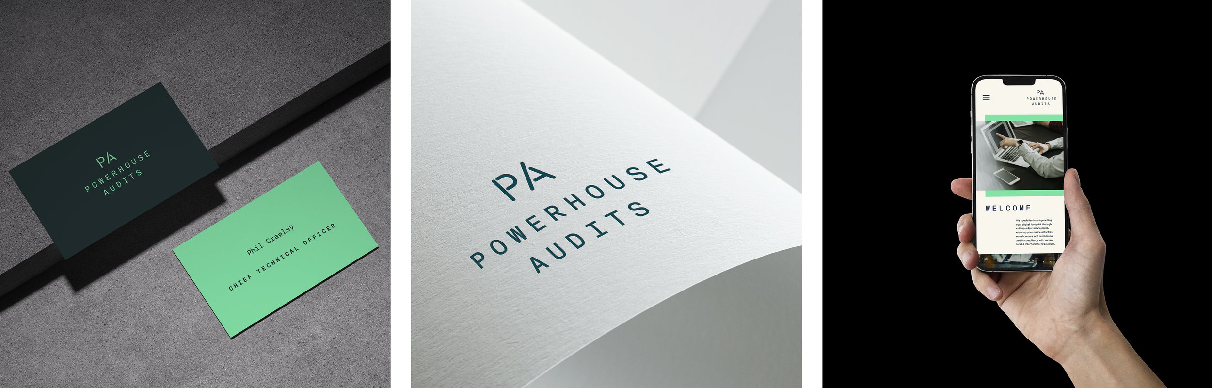
The design solution centred on a dual-mark system. A clear primary word-mark brand was developed to build recognition and establish a strong presence in a competitive marketplace. Alongside it, a secondary graphic mark was introduced to give the brand greater flexibility, reinforcing the identity in a modern and fresh way.
To support the brand, a full exploration of colour families was carried out to ensure the palette could adapt to different contexts and applications. A complete set of brand guidelines was also created, along with a suggested library of imagery to help the client roll out their visual identity with confidence. The result is a cohesive and future-ready brand that reflects the innovation at the heart of Powerhouse Audits whilst giving them the tools to establish themselves as trusted experts in the rapidly evolving world of AI.
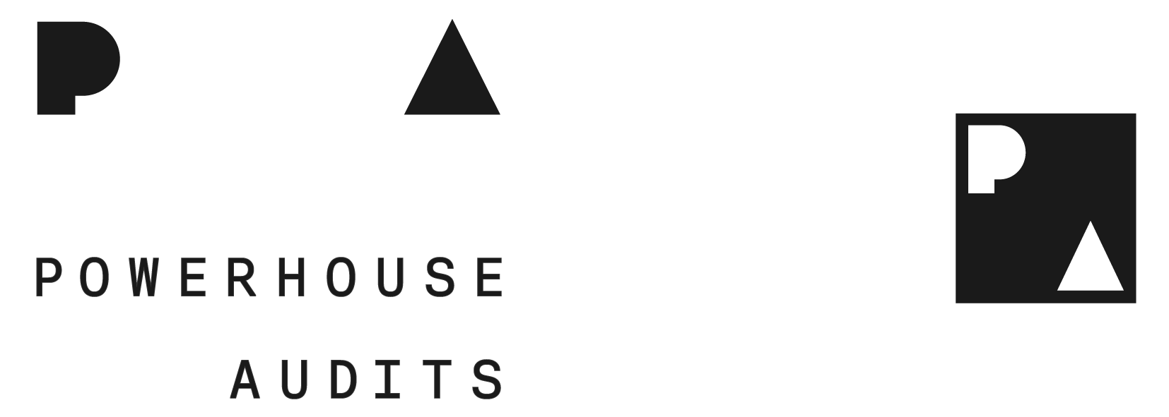
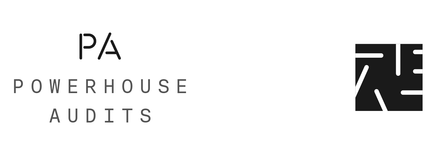
Primary wordmark + graphic mark explorations

Colour family creation

Final Brand creation