BRANDING CASE STUDY
FIORE STUDIO
When Fiore Studio, a sustainable flower farm in Aotearoa New Zealand, set out to grow and dry their own blooms for local sale, they wanted a brand identity that felt as modern and down-to-earth as their practice. With budget an important factor, the design challenge was to create an identity which was distinctive and supremely flexible without relying on expensive photoshoots or stock imagery. The owner also needed to be able take on ordering of promotional materials and creation of assets herself, so ease-of-use was of the utmost importance.
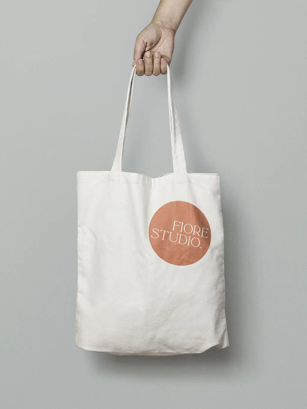
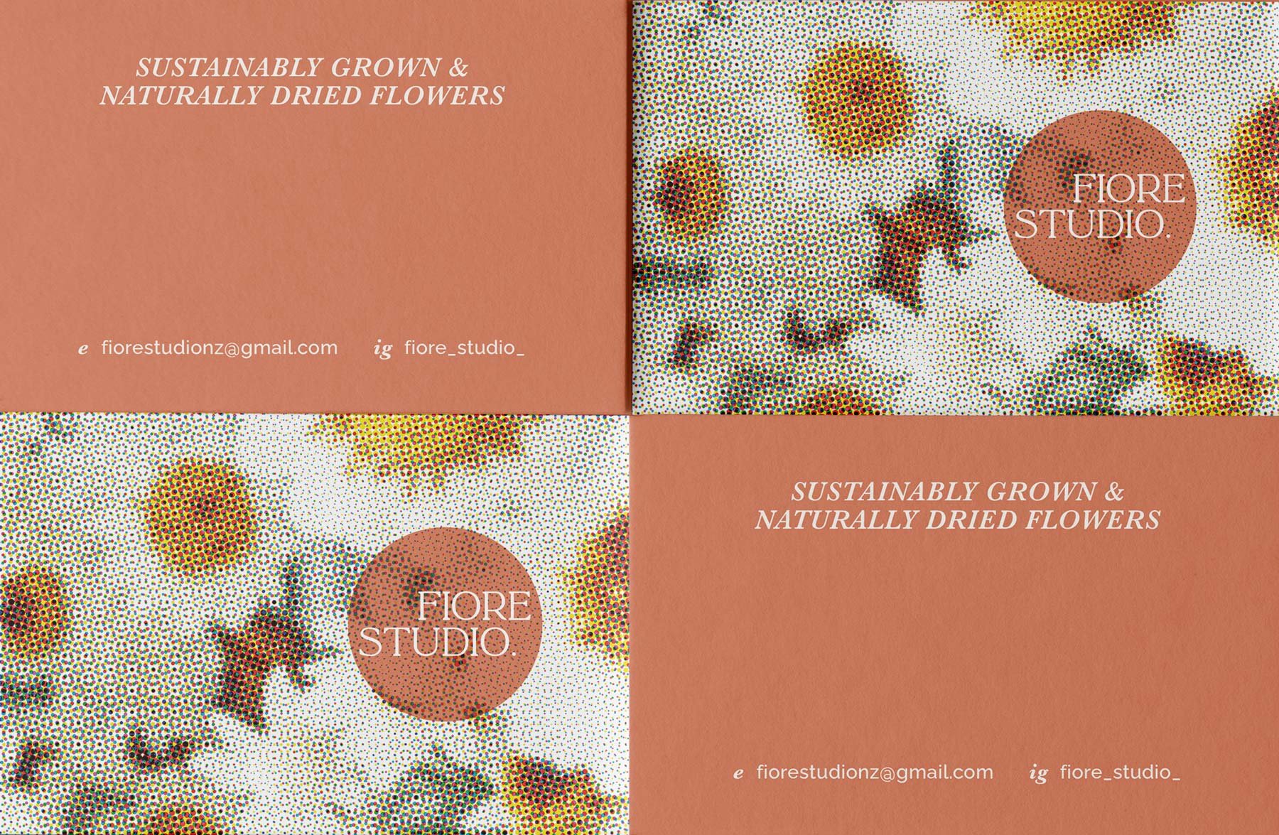
The solution was a clean, modern identity that makes clever use of earthy colour and negative space, paired with halftone treatments of freely available imagery to bring texture and freshness. The logo itself was designed to be adaptable, able to sit neatly within its circle or playfully extend beyond it, giving the client freedom to use it in a variety of ways across different formats.
The result is a brand that feels modern yet approachable, perfectly echoing Fiore Studio’s ethos of finding beauty in the everyday.